Synopsys Outreach Foundation Logo Redesign
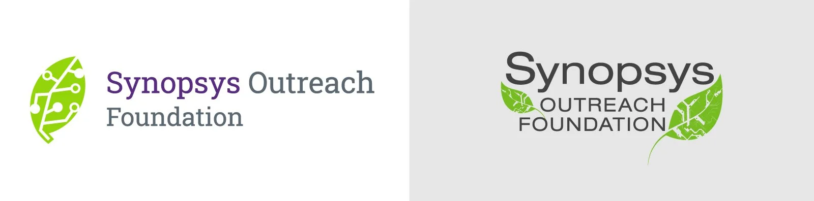
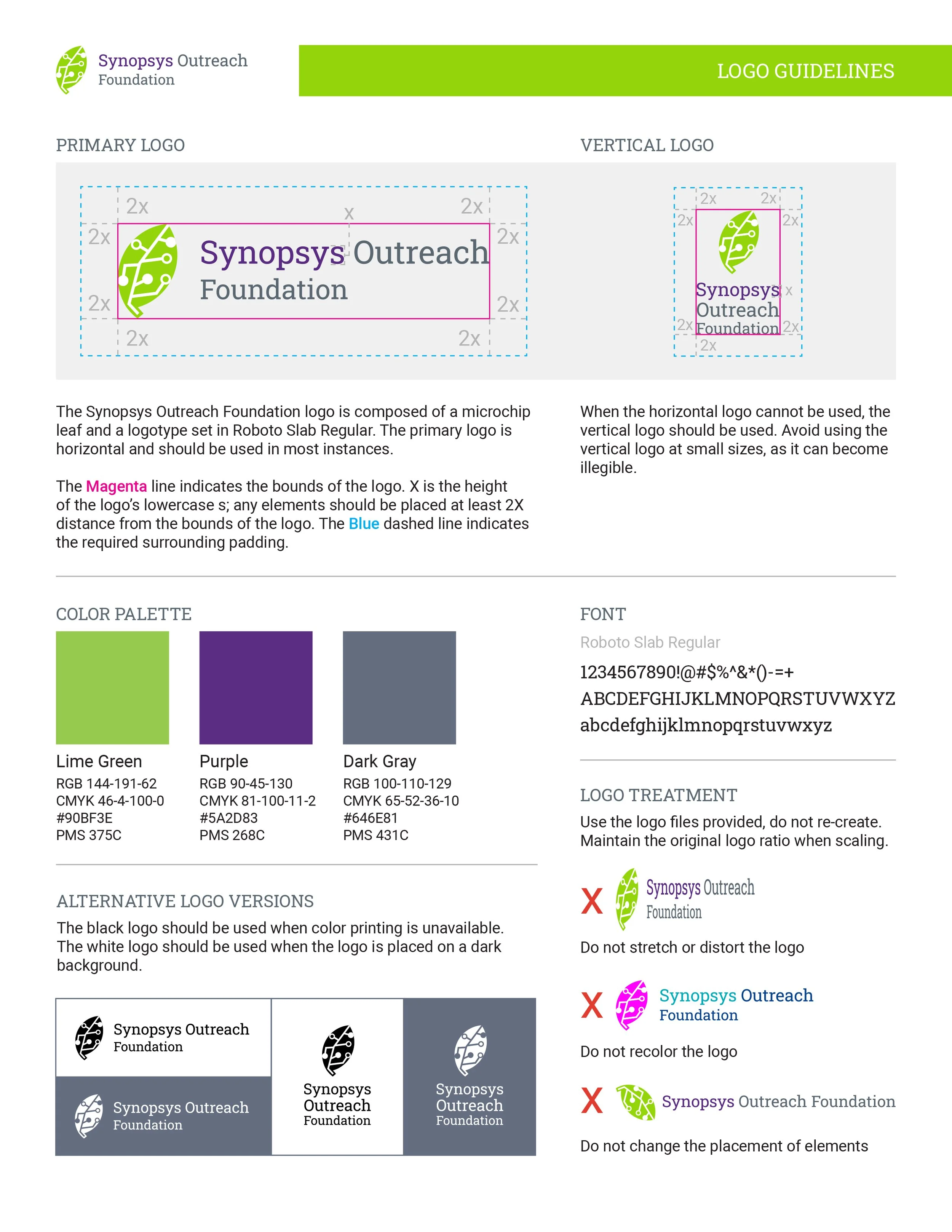
For the Synopsys Outreach Foundation logo refresh, I reimagined the existing identity with a focus on simplicity, scalability, and brand cohesion. The redesigned mark transforms the original illustrated leaf into a clean, modern icon that combines organic and technological forms, symbolizing the foundation's commitment to fostering growth through STEM education. By simplifying the iconography, refining the typography, and improving the overall composition, the refreshed identity is more legible, memorable, and adaptable across a wide range of applications while remaining true to the organization's mission.